How I recreated an F1 broadcast graphic in the browser
A walkthrough of rebuilding a Formula 1 breaking-news card with the F1 Tools editor — team presets, photo framing, and a 1080×1350 PNG export.
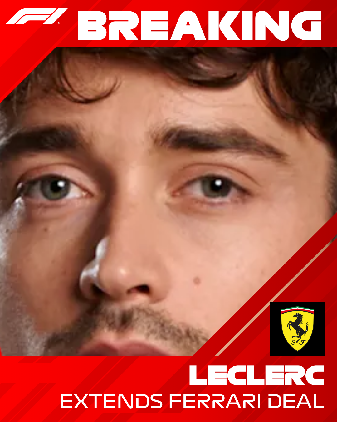
I wanted a graphic that looked like the ones that flash up during an F1 broadcast — bold type, team colour wash, driver photo cut into the frame — without opening Photoshop. This is what I did with the Breaking News generator.
Starting point
Broadcast cards are simple on purpose:
- A strong background colour (usually the team)
- A geometric texture so the flat colour does not feel empty
- One photo
- One headline and a short subtitle
That is exactly the layout on /create: a fixed 1080 × 1350 canvas (4:5), which is the Instagram feed ratio I actually post with.
Step 1 — Team preset, not freehand colour
I picked Ferrari from the team tab. The preset applied the red gradient and the 2026 Ferrari logo in one click. Hand-picking hex codes is how fan graphics end up “almost right” — presets remove that guesswork.

Step 2 — Photo framing
I uploaded a driver portrait (PNG with a transparent background reads cleanest). On the canvas I:
- Dragged until the helmet and shoulders sat behind the headline zone
- Zoomed until the face filled the available space without clipping the chin
- Left a little breathing room on the side where the geometric overlays sit
Busy JPEGs with studio backdrops still work, but they fight the team gradient. A cutout wins almost every time.

Step 3 — Headline hierarchy
I wrote a short surname-led headline and a one-line subtitle. Observations from testing:
- All-caps surnames feel closest to broadcast lower-thirds
- Subtitles longer than ~8 words start wrapping into the photo on mobile previews
- Light text on Ferrari red worked; dark text was better on pale Mercedes / Cadillac washes
Font size in the tool scales with length, so shorter copy stays punchier.
Step 4 — Export and check
Export produced a PNG at 1080 × 1350 — the finished file at the top of this post. I dropped it into an Instagram draft and a Discord channel:
| Check | Result |
|---|---|
| Instagram feed crop | No text lost |
| Discord dark theme | Red gradient still readable |
| File size (typical) | A few hundred KB to ~1–2 MB depending on photo |
No upload spinner, no “processing on server” message — the PNG appeared from the browser download prompt, which matches how the tool is built (client-side capture).
What I would do differently next time
- Start with a transparent PNG instead of cropping a full-bleed press shot
- Keep the subtitle under one line for Stories-style reposts
- Duplicate the URL after tweaking colours — the editor syncs useful state into the query string, so shareable drafts are free
If you want the same workflow written as a reference rather than a story, use the product guide.
Related Tutorials
July 17, 2026
How the starting-grid generator automatically lays out 22 drivers
Inside the F1 Tools starting grid: staggered rows, team colours, 22 slots, and a two-page 1440×1880 export built for Instagram carousels.
July 16, 2026
Creating an Instagram F1 starting-grid carousel
How to export both F1 Tools grid pages and post them as a single Instagram carousel without awkward crops or mismatched sizes.